
Web Layout Settings
Download as PDFOverview
Keep all layout settings for your website in one place. Easily manage colors, the look of your header and footer, and graphics such as your logo and favicon. These elements are all organized into simple tabs.
You can find the layout settings under: Web > Settings > Layout.
Color
In Web > Settings > Layout, in the Colors tab, you can set and manage all color options that are important for your website.
Note
The same color settings also appear again in other sections of the system. No matter where you make changes, they are always saved in one central place.
So it doesn’t matter which tab you use to update your colors.
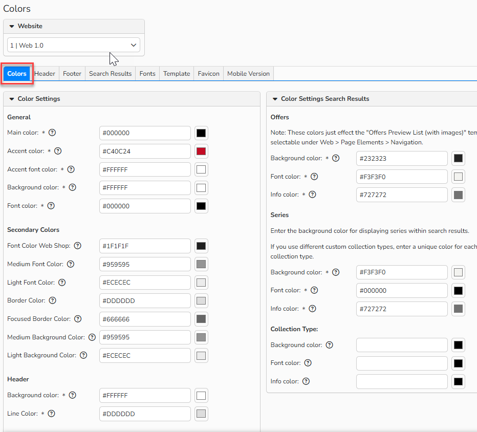
Layout > Tab ‚Colors‘
Color settings
General
- Main Color
Sets the main color for buttons used on the website and webshop (does not apply to the login button). - Accent Color
Sets the color used for accent elements, such as mouse‑over effects on the website and webshop. - Accent Font Color
Sets the font color for areas that use the accent color. - Background Color
Sets the background color of the website. - Font Color
Sets the default font color used across the website.
Secondary Colors
- Font Color Web Shop
Sets the main font color for the webshop. - Medium Font Color
Sets the font color for medium tones. - Light Font Color
Sets the font color for light tones. - Border ColorSets the border color.
- Focussed Border ColorSets the border and text color for focussed elements.
- Medium Background Color
Sets the color for medium background tones. - Light Background Color
Sets the color for light background tones.
Header
- Background Color
Sets the background color of the header area. - Line Color
Sets the color of the lines used in the header.
Main Navigation
- Background Color
Sets the background color of the main navigation. - Hover Color
Sets the color that appears when users hover over main navigation items. - Font Color
Sets the text color of the main navigation.
Search bar
- Background Color
Sets the background color of the search bar. - Font Color
Sets the text color of the search bar.
Navigation at the top right
- Background Color
Sets the background color of the top‑right navigation. - Hover-Effect Color
Sets the hover color for the top‑right navigation. - Font Color
Sets the font color of the top‑right navigation.
Footer
- Background Color
Sets the background color of the footer. - Hover-Effect Color
Sets the color shown when hovering over footer elements. - Font Color
Sets the footer’s text color.
Color settings Search Results
Offers
- Background Color
Sets the background color of the offers page. - Font Color
Sets the text color on the offers page. - Info Color
Sets the color of informational text on the offers page.
Series
- Background Color
Sets the background color of the series page. - Font Color
Sets the text color on the series page. - Info Color
Sets the color of informational text on the series page.
In the Collection Type section, you can specify colors that differ from those used for series. If you use multiple collection types, you can define the colors for each collection type. If nothing is specified, the colors of the series will be used.
Note
The Offer colors only affect the page template “Offers Preview List (with images)”. You can select this template under: Web > Page Elements > Navigation > Edit Element.
Header
In the Header tab, you can set and manage all color settings for the header area. This is also where you choose and manage your website’s logo.
Note
The individual color settings in the Header, Footer and Search Results tabs are repeated in the Colors tab. The changes are stored centrally, so it doesn't matter which tab you use to make the settings.
You can find an explanation of all the color settings available for your website in the previous section Colors.
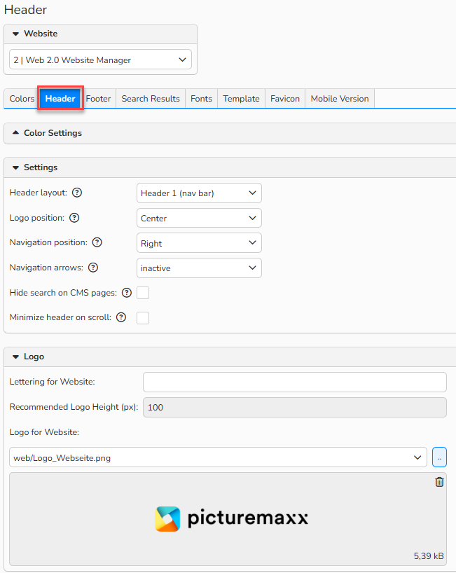
Layout > Tab ‚Header‘
In the Settings panel, you can choose different navigation and logo layouts:
Settings
Header layout options
In the Header Layout drop-down, you can choose from different layout designs:
- Header 1 (Navigation)
Displays the navigation menu below the logo.

Header Layout: Header 1 option
- Header 2 (Navigation & Search)
Displays the navigation below the logo, highlights it visually, and adds an integrated webshop search via a magnifying‑glass icon.

Header Layout: Header 2 option
- Header 3 (Compact Navigation)
Shows the navigation on the same level as the logo at the top of the screen.

Header Layout: Header 3 option
Logo Position
In the Logo Position drop-down, choose where your logo should appear:
- Left, Center, Right
Navigation Position
In the Navigation position drop-down, choose where the navigation menu should appear.
- Left, Center, Right
Navigation Arrows
In the Navigation arrows drop-down, turn the navigation arrows on or off (shown on the right side of the screen).
- Active / Inactive
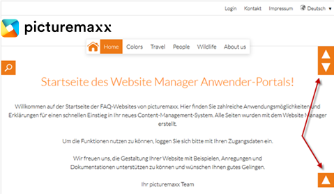
Example Navigation Arrows
Hide search on CMS pages
If you activate the checkbox, the searchbar at the header is only visible at the webshop.
- Active / Inactive
Minimize header on scroll
Activating the checkbox gives you the option to minimize the header on scroll down, allowing more space for content.
- Active / Inactive
Add logo
Use the Logo panel, to upload a logo file and add the logo to your website. For details see the Website Logo FAQ.
Lettering for Website
Enter lettering here that should be displayed on your website as an alternative to the logo, for example, the name of your company.
If a logo file is uploaded and a name is entered, the logo and the text entered here will appear.
Note
This lettering also serves as the main heading for all pages of the website and is therefore relevant for search engine optimization. You can find more information on this in the FAQ Search Engine Optimization.
Tip
Deleting your browser cache and site cookies
If the changed or newly uploaded logo is not displayed immediately after accessing your website, please delete your browser cache and the site cookies for your website.
You can find out how to do this in your browser on the respective websites of the browser operators.
Note
If you would like detailed information about document management, please refer to our FAQ Document Management.
Footer setup
In the Footer tab, you can set and manage color options for the footer area, as well as positioning settings.
Settings
Footer layouts
- Footer 1 (Vertical)
Displays the footer elements stacked on top of each other.

Footer Layout: Footer 1 option
- Footer 2 (Horizontal)
Displays the footer elements next to each other.

Footer Layout: Footer 2 option
- Footer 3 (Compact)
Shows the navigation on the same level as the logo at the top of the screen.

Footer Layout: Footer 3 option
Search Results
Here you can define the colors for your webshop, if you haven't already done so in the Colors section above.
Fonts
In the Fonts tab, you can define and manage the font size and font types.
Note
Not all common fonts can be supported because many font sizes are predefined in the system.
Font sizes
In addition to the default setting (100%), you can choose from 4 other font sizes.
Available fonts
Here you will find all fonts stored in the system as well as the default font “Lato”. You can also upload your own fonts and use them for your website via Edit > New.
After clicking on one of the fonts displayed, you can see in the Font tab whether it is a system font. These cannot be deleted.
In the Font Family tab, you will find all the variants in which the selected font is available.
Important
Own fonts: Fonts used should be compatible for web use. Therefore, the use of web fonts is recommended. To ensure that the desired font is displayed correctly in all common browsers, it must be uploaded in various formats. These include: EOT (Embedded Open Type), OTF/TTF (Open Type Font or True Type Font), SVG (Scalable Vector Graphics), WOFF/WOFF 2.0 (Web Open Font Format). In addition, fonts that have already been used in the WYSIWYG editor should not be deleted, as they will then not be displayed correctly.
General Data
In the General Data section, you can specify the following for the selected font:
- Font is active: The font is enabled for use in the WYSIWYG editor. It can be used in all existing templates.
- Font is the Default: The font is used as the default font in all templates on the current website.
Page templates
In the Template tab, you can manage the template selected for your website. For examples of each template, visit our help page: https://howto.picturemaxx.com/.
Favicon
In the Favicon tab, you can upload and manage the favicon and touch icon used for your website.
Manage Favicon for Website
The favicon appears not only in the browser’s address bar, but also in page tabs and bookmarks.
Manage Website Touch Icons
Touch icons are large square icons used for smartphone home‑screen bookmarks and browser start pages.
In the Manage your Website Touch Icons panel, you can upload touch screen icons for Apple and Android.
Note
Detailed information about the favicon and document management can be found in our FAQs Website Favicon and Document Management.
Mobile Version
In the Mobile Version tab, you can enable or disable the optimized display of your website on mobile devices in the Settings section.
Note
Template layouts may look slightly different to ensure a better mobile experience.