
Define Block Layout
Overview
Blocks are reusable elements that make up your website pages. You can place and rearrange them within the theme’s regions from the Block layout page.
Note
Drupal offers a number of default blocks to be placed within the block layout. Since these are not part of picturemaxx Drupal CMS, please refer to Drupal documentation for more information.
Getting started with blocks
To access the Block layout setup page, navigate to Structure > Block Layout. Here you can:
- Select a region of the site to place a block of reusable content there.
- Use default blocks and add custom blocks.
- Easily reposition a block within regions.
- Control on which pages exactly a block will appear.
Default blocks
Go to Structure > Block layout to view a predefined structure that serves as a starting point for your website. Some default blocks are already configured by default, for example:
- Header Menu
Contains the login and registration links and icons (upper right corner of a web page). - Language Switcher
We have placed the language switcher next to the header menu by default. - Site branding
Contains your website logo. - Main navigation
Contains the primary navigation menu and is placed in the Navigation region by default.
Content blocks
To create a content block, navigate to Content > Blocks > Add content block.
The Content block menu has the following block types ready for you:
- Awards
Allows granting awards in the content suffix area. - Basic block
Offers a basic layout consisting of a title and body content. - Search bar
Adds a search bar to your webshop. - Section
Allows adding different paragraph types, such as a regular section, a form, or a spacer.
Block layout and regions
You can place blocks into theme-specific regions of your website. Regions define where content appears on the page, such as the header, navigation area, or footer.
Note
The displayed regions belong to the default picturemaxx Base Theme.
Other themes are not relevant for the website configuration.
To manage block placement, navigate to Structure > Block Layout.
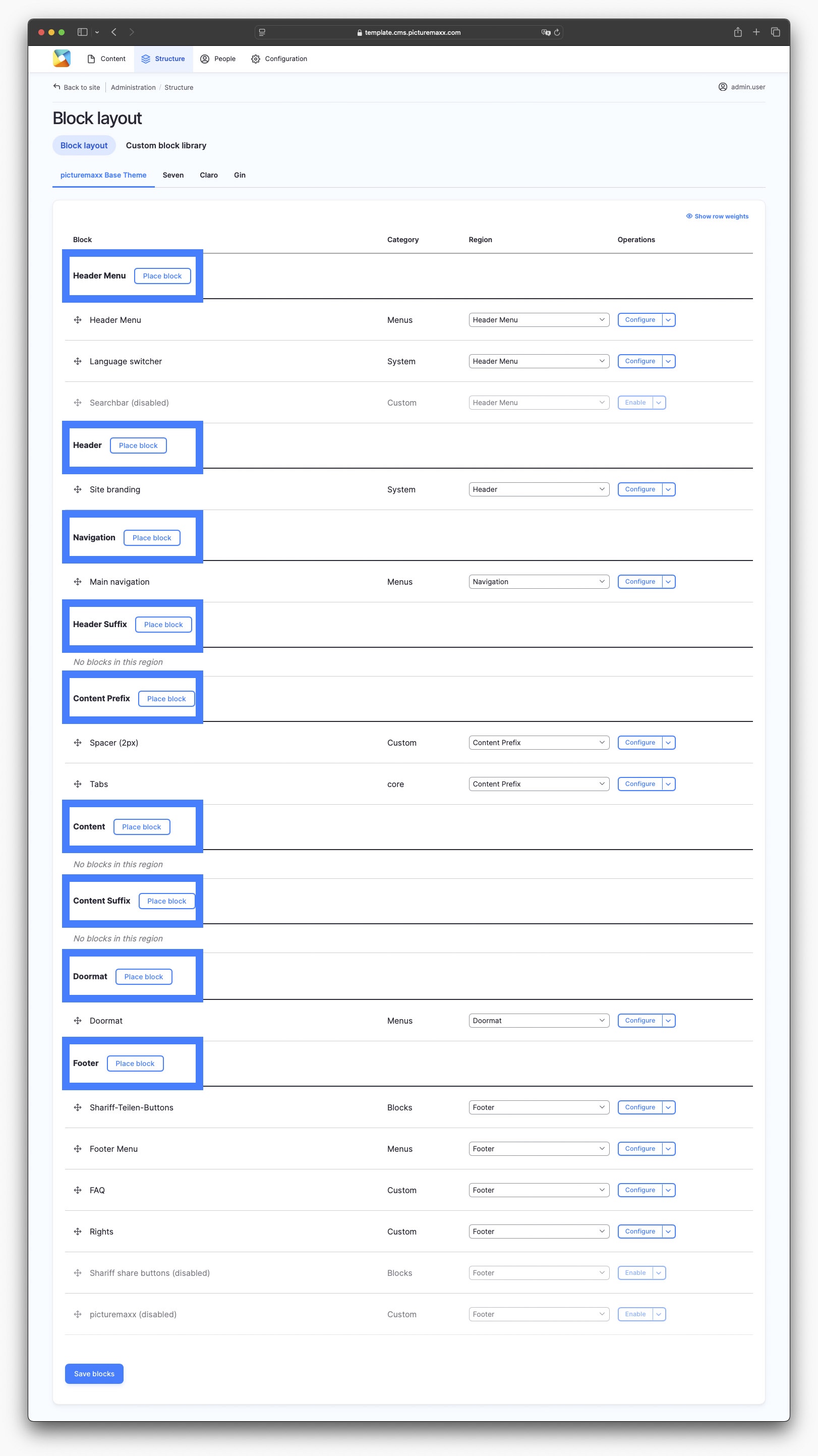
This is the Block layout setup of the Demo Page. You can use it as a starting point and customize to meet your website's requirements.
Region overview
Header Menu
The Header Menu region is located in the upper-right area of the page and is typically used for utility functions.
By default, it contains the Header Menu and Language Switcher blocks.
Header
The Header region contains the Site branding block by default.
Navigation
The Main navigation block is placed in the Navigation region by default.
Header Suffix
The Header Suffix region is well suited for additional site elements (e.g. Search bar for Webshop).
Content Prefix
When you log in as Admin, the content menu tabs appear in the Content Prefix region.
Important
We do not recommend changing this setting.
Content
Unlike other regions, this area is populated by unique page content rather than reusable blocks. For this reason, no default blocks are placed in this region on the Block layout page.
Content Suffix
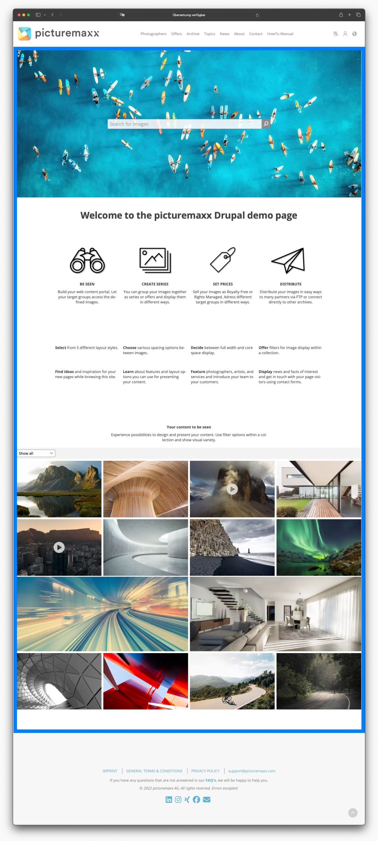
The Content Suffix region is ideal for placing Custom blocks. On the Demo Page , this region contains a newsletter registration form.
Doormat
The doormat of a website can contain a site map or directory, helping visitors find important sections of the website. It usually appears at the bottom of a page, often in the footer, or, like in our Block layout, right above the actual footer . It acts as a roadmap when a landing page has a series of pages to link to.
Footer
The website footer appears at the very bottom of every page. It typically contains supporting information, such as contact details, links to important pages (like Privacy Policy or General Terms and Conditions), social media icons (Shariff Sharing Buttons), and sometimes a newsletter sign-up form.
Place blocks
Use blocks to add reusable content and functionality to different regions of your website, such as the header, navigation, content area, or footer.
Note
Only the default picturemaxx Base Theme is relevant for your settings. Just ignore the themes Claro, Seven, or Gin.
Place a block within a region
- Navigate to Structure > Block layout.
- Locate the region of the site where you want to place the block (for example, Header, Header Suffix, or Footer). Click Place block next to the region.
- The Place block dialog is displayed. It lists all the blocks both offered by the system and custom-made by you.
- In the Place block dialog, filter or browse the available blocks. Click Place block next to the desired block name. The Configure block dialog is displayed.
- In the Configure block dialog:
- Enable Display title if you want the block title to be visible on the page.
- Use the Visibility settings to control where and for whom the block is displayed.
- If you do not configure any visibility settings, the block will be displayed on all pages by default.
- Check that the correct region is selected for the block in the Region dropdown.
Example: Place a Search Bar
To place a Search Bar below the page header:
- Navigate to Structure > Block layout.
- Click Place block next to Header Suffix.
- Find Search Bar in the list of available blocks and click Place block next to it.
- Review the block settings and visibility options.
- Click Save block.
The Search Bar will now appear below the main navigation on all pages of the website. 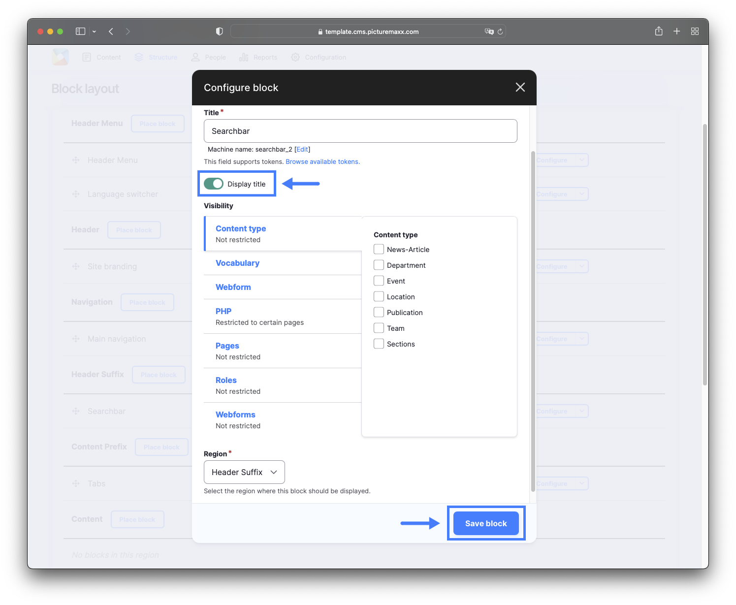
Change a block’s position
You can move blocks within the current region or place them in a different region altogether.
- Navigate to Structure > Block layout.
- Move the block using one of the following methods:
- Drag and drop the block to a new position.
- Select a different region from the dropdown menu in the Region column.
- Click Save blocks at the bottom of the page.
The updated block order and placement will be applied immediately.
Quick Demo: Move the Search Bar to a different region
Configure block visibility
It's useful to be able to display blocks everywhere at once. But on some pages you might want to make an exception.
To configure block visibility:
- Navigate to Structure > Block Layout.
- On the Block Layout page, locate a block and click Configure.
- On the Configure Block page:
- Choose to show or hide the block title.
- Add exceptions to the block's visibility:
- In the Visibility section, select Pages and enter page paths to show/hide the block on those pages.
- Save your changes.
Note
If you leave the visibility settings empty, the block will be will be displayed on all pages by default.
The video below will walk you through the procedure. You can use the same procedure to configure the visibility of any other block.
Quick Demo: Hide social media icons on the Imprint page
Add blocks
Depending on your needs, you can add custom content blocks or place existing system blocks.
Add a content block: Search bar for Webshop
Add a search bar to help visitors search your webshop.
- Navigate to Content > Blocks > Add content block > Search Bar.
- Configure the following fields:
- Block description
Enter a brief description of the block. - Search Field Label
Placeholder text displayed in the search field (for example, Search for images...). - Webgate Search URL
Enter the URL of your webshop. Contact our support team if you need assistance obtaining the correct URL. - Use main background
Activate to apply the main background defined in the theme settings. If disabled, the block uses a transparent background. - Sticky
Activate to keep the search bar fixed while the user scrolls. - Use advanced search
Activate the advanced search based on filters and classifications configured in Backstage.
IMPORTANT: Requires Backstage API key and default settings configuration (e.g.,website ID). Contact us at support@picturemaxx.com for details and guidance. - Autocomplete
Set up the autocomplete feature based on classifications configured in Backstage.
IMPORTANT: Requires Backstage API key. Contact us at support@picturemaxx.com for details and guidance. - Revision Information
Optionally, add a comment describing the changes you made.
- Block description
- Click Save.
Add a content block: Reusable Section
You can tailor a paragraph type (for example, Contact Form) and use it across your website.
To build a reusable Section block:
- Navigate to Content > Blocks > Add content block > Section.
- Configure the following fields:
- Block description
Enter a brief description of the block. - Language
Select the language for the content block. - Add Section
Choose one or more of the available paragraph types: - Revision information
Add comments about the changes you made.
- Block description
- Save your changes.
Add a default block: Social media buttons
You can add social sharing buttons to predefined regions of your website.
- Navigate to Structure > Block layout.
- On the Block Layout page, scroll the list down to the Doormat region, and click Place block to view available blocks.
- In the Place block dialog, search for Shariff Sharing Buttons and click Place block to add it.
Note
Shariff Sharing Buttons is a Drupal module that enables website users to share content without compromising their privacy.
The video below will walk you through the procedure.
Quick Demo: Add social media icons to Doormat
ALT TEXT The video below demonstrates how to add the Social Media Buttons block to the Doormat region of a website.